

A New Logo
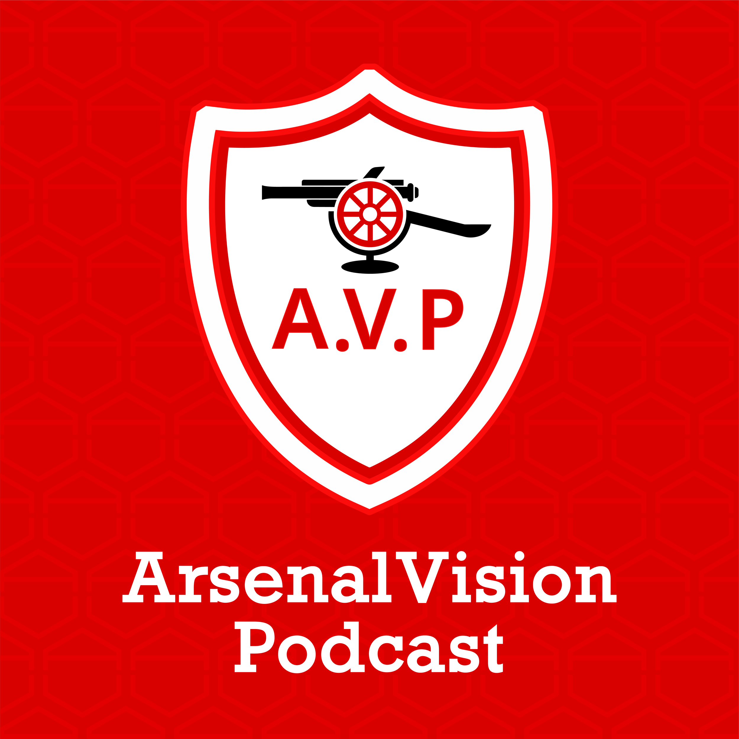
The new ArsenalVision Podcast Logo.
So… change is scary. I personally don't like change at all. Unless that change is Arsenal turning into the best team in the world, in which case I'm quite comfortable with it. But in this case, it's a bit less exciting and maybe less welcome.
After many years, we are updating the logo for the pod.
First, let me just say that this is something we've wanted to do for a while. Bluewire made the existing logo for us in a pinch, when we had a low-res version that needed to be updated and didn't have time to do it ourselves. The "post match podcast" bit wasn't really relevant anymore (now it's an "every day podcast.") The font was tough to work with and the text wasn't even aligned. Plus, what was that weird fabric material in the background? Don't ask me, because I have no idea.
So we wanted to update to a new logo with a few key considerations. Firstly, we wanted to work with someone in our community. Which we did. This was designed by Brandon McKenna, who is a wonderfully talented man, new parent, Arsenal supporter, and fellow Patron. You can see the new logo he designed in the image above.
Second, we wanted something connected to Arsenal thematically, but not "owned" by Arsenal specifically. And that's where the badge comes in. What Brandon recreated is an homage to Arsenal's badge during the Herbert Chapman era – specifically 1930.

Arsenal's 1930 Badge
That season, Arsenal won their first ever FA Cup, on the way to becoming the most successful club in the history of the competition. In the picture below, you can see the Arsenal "boys" (who all look like they're in their mid 40s, life was hard back then) proudly holding the cup, and displaying the badge on their.... burlap shirts? Definitely didn't have the "Air-cooling HEAT.RDY technology" on that kit.

Our first ever FA Cup.
In our new version, the cannon also doubles as a microphone which I think is pretty clever!

Brandon also created a "hex" background that's reminiscent of an Arsenal badge of the late 30s and 40s, but is actually "A" and "V" which you notice if you look closely. All-in-all, I think he did a great job!

Another thing we wanted to achieve with the new logo is to design something that we can continue to use wherever we want, without anyone deciding at some point that what we are using actually belongs to the club. I don't think that was going to be an issue, but why tempt fate?
So you'll see this new logo now on pod players and social media etc. The badge will stand alone in some places, but on pod players, the name will still be there. As I said at the top, changing anythingcan be hard. For me in particular, this change is actually terrifying which probably tells you that I need to relax, but it's not like that wasn't obvious already.
If you have thoughts (and I know many people will), we're obviously happy to hear them. But please bear in mind that this was the creative process of a person who I really admire, and appreciate, and so I'd ask that any comments stay respectful of the work he put in.
Thanks for sticking with us through this trivial change that I've taken way too seriously. Here's hoping this new badge will bring us the same good fortune of the 1930 badge.
Love you and talk soon!